USSR: After 20 years

Delighted to be back after three weeks of treatment, care and medication. I rarely fall ill, so this afforded a nice break from my regular activities and also the chance to browse several websites which deal with data analysis and presentation.

My data-set for this week is from the Guardian Datablog, dated Aug 17th, titled "End of the USSR". The piece is accompanied by an image that uses a map to rate the former soviet provinces on their performance since the collapse.

The data includes yearly figures of GDP, GDP per Capita, Population, Life expectancy and Mortality among other interesting indicators like Intentional homicides, Prison population rate, Prevalence of HIV by gender, Unemployment, Happiness index score, Global peace index and Number of McDonald's!

Given the large difference in figures between Russia and other republics, I was curious to see how the presenter would design the population and the GDP charts for comparison.

I was massively disappointed. The population chart is simply a column chart representing the percentage change of population in 2009 from 1991, and a label to display the current population - very much an easy way out. The GDP chart can be found nowhere, although there is a clustered column chart that displays the GDP per Capita for 3 years out of 20. 1991, 2000 and 2009.

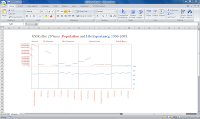
I spent an idle afternoon working on the Population and Life expectancy data and came up with the following after 2 hours.

Comments

Popular posts from this blog

Florence Nightingale Circumplex Chart

I was taken to the  Florence Nightingale's Wiki page   during a recent research, and one of the interesting things I noted was her contribution to statistics. It came to me as a pleasant surprise that she is credited with inventing the polar area diagram , or occasionally the Nightingale rose diagram, which is equivalent to a modern circular histogram. Following the completion of my project and in my weekend to spare, I devoted time to recreating the chart in Excel. It took a combination of Doughnut-Pie-and XY charts and close to four hours to finish it. The colours are a bit darker, the values are approximate and the labels differently oriented, yet the chart looks fairly close to the original as is shown by the picture below.

The Cricket Graphs: The Forgotten Chart

The fun of receiving feedback to blog posts is that one isn't quite sure what they might come up against. While mostly it provides fascinating discussions, insightful comments or explanatory questions, there is also the odd occasion when it throws up unusual requests. The other day I received an email in response to my post, The Cricket Graphs . The sender wanted me to create a "Partnership" chart, which would show the runs scored by the pair of batsmen for every wicket and the balls faced. I went searching for data on the Cricinfo website , and picked out the 3rd ODI  between the South African and Australian cricket teams which was played out in Kingsmead, Durban on October 28, 2011. The Partnership details were taken from the page titled Partnerships Table and the total balls faced by individual batsmen from the Scorecard. Constructing the graphs was a somewhat tricky affair, with two potential bar charts in two axes representing Balls and Runs, which had me w...

The Playfair Charts: Wheat Price and Wages

After successfully recreating the Playfair trade-balance time-series chart , I took up the second chart shown in Jorge's post which is fancifully titled, "Chart showing at one view the price of the quarter of wheat and Wages of Labour by the week from The year 1565 to 1821." I left out the top arches. Comparatively, this was the easier chart. Staying true to Jorge' rules, I didn't use any shape or clipart objects in this chart. The big oval shaped object in the middle of the chart, which contains the title is actually a marker for a data point. The original Playfair Wheat price and Wages chart from Wikipedia, and underneath, is my version in Excel.